

True Confession: I’m a cover snob. I’ve been known to ignore a book because I didn’t like the cover. Shallow, I know, but cover eye candy is part of what draws me to a book. A few weeks ago, Tracey mentioned older books getting makeovers – kind of a new and improved rebirth of an older title — and how she much preferred the book’s original cover. And that’s what got us thinking that this might be a fun Conversations with Kav topic so, here we are! Plus, I want to talk about overall cover appeal. What we love. What we don’t. What sells and what sends us running screaming out of the bookstore. 🙂
First: the book Tracey mentioned liking the original cover better than the ‘new and improved.’
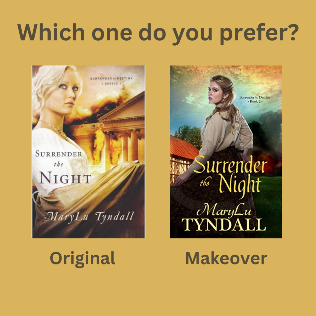
I like the Original cover too. As far as makeovers go, this one isn’t bad at all, but there’s something more dramatic about the original. I think the heroine’s personality shines through much better. She’s daring me to read her story.
Two series immediately came to mind when Tracey and I had a mini discussion in the comment section of that previous Sunday post. And I much, much, much, prefer the originals in both cases. So much so that I am ecstatic to have the originals in my collection. There just isn’t any contest, as far as I’m concerned. Here they are:

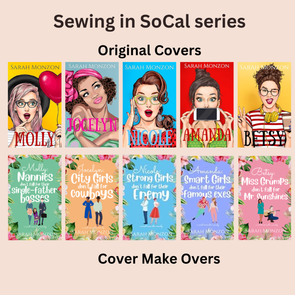
I’m going to be brutal here. I LOVE the original covers for both these series. They are vibrant and alive and so unique. Real standouts. The makeover covers are, well, blah. Like every other romantic comedy cover out there. And I don’t like how there’s less emphasis on the heroines. You can really get a feel for their personalities in the originals but you can barely see them in the new covers.
Why do authors / publishers reissue books with new covers?
The only reason I can think of is if an author gets the rights back to a traditionally published work and maybe there’s something in the contract that says they can’t market the original cover? But I’m just guessing. And that doesn’t explain why an indie author would switch covers. That must be a costly undertaking. Anyone have insider knowledge or other insights? Inquiring minds want to know. 🙂 There must be a marketing angle in here somewhere.
What do you like/dislike in a book cover?
- I like original. I love colour. Texture. Details. Something that creates an ambience to match the story.
- I definitely want to be able to read the author’s name on the cover.
- Bonus if it’s a series and that’s indicated along with the series number.
- I’d prefer a simple, nondescript cover to a poorly designed one. I totally understand that indie authors don’t have the finances to fund graphic artists or create cover photo shoots the way publishers can. BUT, simple is way better than an amateurish attempt to create cover art. (is my cover snob showing?!)
- I’m in the middle of the road about faceless covers. Don’t mind as much when the figures on in the distance, it’s a little more jarring when the whole cover is a faceless hero or heroine. 🙂 But it helps when there are other elements on the cover that hint at the story. I’m thinking of the Sweater Weather series with it’s bright colours and fall themes. Clearly, now that I think about it, I’m attracted to colour.
- I love the fashion on historical covers!
- And one thing I’m totally not a fan of is Disneyish cartoon covers. Like this one:

I feel like this should be the cover of a graphic novel for preteens. 🙂 Just not a fan. I’m wondering if it’s becoming a trend in order to attract new adult readers? By the way, this book is releasing in September and it’s set around a Regency themed singles retreat which sounds fantastic! Hopefully it will be available in audible so I won’t have to look at the cover. Bwahahaha!
Okay, now it’s your turn. Share your cover loves/hates and opinions in a comment below and I’ll put your name in a draw to win a $10 Baker Book House ecard.

Draw will be held and winner announced on Saturday March 22, 2025.

I really like covers with the protagonist in beautiful dresses! I don’t think I’ve decided how I feel about faceless covers 😉
LikeLiked by 1 person
Yes…more luscious gowns and less faceless people! 🙂 Good luck, Stephanie!
LikeLiked by 1 person
The biggest reason authors/publishers redo covers is to try to make more sales. Maybe the author had hired a cheaper cover designer originally and wants to get a higher quality cover. Maybe the cover no longer fits genre trends. Maybe the book wasn’t originally intended to be part of the series, but now it will be, and why not make a few changes while you’re already fixing things.
I don’t like pink, yellow, or orange covers usually. I also don’t like covers with font that isn’t for book covers.
LikeLiked by 1 person
Hmm….that sets me to wondering who gets to pick the genre trends for covers? I wanna be on the panel. Bwahahaha! Interesting point about matching fonts with the cover art. I hadn’t thought about that but it can be jarring for sure. Interesting cover aversions here, Courtney. I’m the opposite. Splash me some colour and I’m all ‘ ohhhh, gimme!’ Good luck!
LikeLiked by 1 person
I am not a fan of faceless or cartoonish covers. I like the real people!!! I also struggle with cover redos. If I’m trying to complete a collection, it’s an annoying aesthetic issue to have some books in the series of one design, and the others a different one. I have a set of Lori Wick books that are just like that. Drives me nuts!
kathrynlvossATgmailDOTcom
LikeLiked by 1 person
I agree- not a fan of the faceless- I run the other way!
Another reason to not be in favor of changing covers: they may not be the same size!!! Then they don’t fit on the shelves nicely.
LikeLike
Yes, real people or artfully drawn people? If that makes sense. And great point about redos messing wth competing a series collection. I haven’t experienced that…yet, because I tend to buy my faves as soon as they are published. However I can totally see that happening when I play catch up with author backlists I don’t have yet. Argh. good luck, Kathryn!
LikeLike
I’m with you Kav, I’m a cover snob too. I can’t imagine spending all the time it takes to write a book then putting a mediocre cover on it. A cover makes or breaks a book for me.
I know a bit about Sarah Monzon’s choices for her SoCal series as I’m in her Book Squad and we discussed it. While a lot of us preferred her original covers she said she always like them too, but they didn’t sell as well as expected so she decided to revamp. Her decision was totally from a marketing standpoint. She also said readers who devour romcoms want to see the trope at a glance when they are scrolling through amazon looking for their next book to read. I guess the new covers do accomplish what she discovered was necessary to up her sales.
I think it’s so interesting what often has the most visual appeal isn’t always what sells the best. Romcoms have become a huge market, but I only read a few and usually by an author that I like. Some are just silly to me, some are hilarious. I agree about the cartoonish cover. That book you show might have some real depth in it, but a lot of readers may never know based on not choosing it because of the cover. You nailed it when you said Disneyish and graphic preteen. Bethany missed the mark on that cover.
Another cover topic is AI covers. While I’m not a big fan of AI in general I have to admit they are producing some fantastic covers. Some of the most beautiful historical covers I’ve seen are by AI. The downside to it though is some of the people look so perfect, so handsome or flawlessly beautiful, the next time I see a book with a real model it doesn’t always have the same appeal. Now I’m starting to wonder if we are being slowly reconditioned into not picking books that don’t have that perfect look. Hard to get the balance right but I’m trying to be aware of this when scrolling books, especially when it’s an unknown author.
We are twinning with a lot of the same preferences like color and historical fashions. I also like the fashionable model to have a historic home or building in the background that gives a further clue to the content.
This is such a good discussion. I enjoy seeing what draws other readers to the books they choose, including you, Kav. Thanks for the giveaway. tracey14567 at gmail dotcom
LikeLiked by 1 person
I did think of an exception to my cover love standards. What if it’s an author I know and enjoy has an upcoming cover that’s a miss in the “hit or miss” category. As an example, Amanda Cox has an August book, The Bitter End Birding Society. When I saw her name, I immediately put it on my reading list. BUT…that cover is the least creative one I’ve seen in recent months. Now if I find out one of her kids drew it, as a mom I’m going to say good line drawing. As a reader fan I ‘m going to say better luck next time, if I’m a new reader scrolling Christian fiction and this cover shows up, I’m passing it right by as a book with zero cover appeal. If Revell’s art department sent this to me as an author for approval, I’d be saying please go back to the drawing board, literally. I know, I know, I do have strong opinions on my covers, lol.
LikeLiked by 1 person
Of course I had to rush over and see an image of The Bitter End Birding Society and, yes, very understated and the colour choice makes it look like the book is intentionally meant to fade into the woodwork. I wonder if it will make more sense once we know the story inside?
I’m so glad I’m not alone in my cover snobbery. 🙂 Interesting insight into Sarah Monzon’s cover make over. I wonder if her new look increased sales? I’m totally out of touch with what’s in trend if that’s the case. I adore the originals. I’d make them wall art in my huge library – maybe arranging them over the fireplace for a focal point. Bwahahaha!
Re Rom/Coms — the trouble with having all the covers so similar is that it becomes difficult to determine if I’ve read a book or not. My first connection with a book is the cover but when all the covers look the same it becomes a frustrating investigation to figure out if it’s a book I’ve read. Especially since I’m fairly new to the rom/com genre and I’ve been reading a lot of new-to-me indie authors. And Mollie Rushmeyer’s first two books have so much depth and grit and substance…not sure if she’s switching genres but that cover doesn’t match her previous storytelling. Definitely a book I’ll read…not in print though but only because I’m familiar with her writing. Hopefully it will come out in audio format as well.
I had to google images for AI generated book covers to see what you meant. And, wow, are there ever a lot of them. And I see what you mean. I’m not a fan of AI either but I find it particularly offensive when it’s used to replace human creativity. I’ve even heard that authors books are being used to give AI a basis to create cheaper novels. What????
And great point about what’s in the background of a cover. Can definitely add to the overall story vibe as well as draw me in. Fun chatting with you, Tracey. Good luck!
LikeLiked by 1 person
I’m with you on the original cover being my first choice probably because of the bright colors and the eye – definitely the eyes – that tell a story that you want to read. However, I won’t snub my nose at the new one either just not as dramatic.
Faith and Fortune covers – the originals are by far much better. Don’t like the faceless type look of the new ones. As I stated above, the eyes tell a story so I want to see them.
Sewing in SoCal series – there’s no comparison to the vivid expressions in the originals over the small non-descript new ones.
I have heard authors talk about having to change covers when they get the rights to their books back. The only reason I can think of when it’s entirely the author’s choice – to lure readers back to reading this book – even old readers. I’m a proud cover snob and even in a re-release would more than likely remember the previous cover. With time sometimes the plot may fade. It’s like seeing a movie or reading a book and having to be 10 minutes in before it dawns on you that you’ve seen or read this book before. If that is the case, then I say shame on the authors. While we might have loved the book the first time, why have us waste money on the new version because we have been tricked?
LOVE the color purple, which always draws my attention. Love when the cover conveys a story or a hint to a story meaning I want what’s on the cover to be IN the book. I can immediately know a book is not for me if sexually explicit. I don’t need or want half clothed people on the cover. Maybe because I’m getting old, but want the title and the author big enough and in a type print that is easy to read. Knowing the author will draw me to checking out a book for sure. I’m not a cartoon, kid’s type drawing or anime lover on a cover.
Do love knowing if in a series and especially nice to have the number of the book in the series on the spine. That way I can place them accordingly and not have to take them all out to see which one to read in what order.
Love when a cover conveys the time period of the story. It can show the fashion of the dress or the backdrop picture, but make it clear about when this story takes place. Even a split photo is nice when it’s a dual timeline story.
2clowns at arkansas dot net
LikeLiked by 1 person
Yessss! And I love me some drama on a cover heroine. 🙂 I don’t think I’ve heard anyone say they prefer the new Faith and Fortune covers. I’d love to know if the sales improved with they new look. And SoCal is my favourite collection of book covers. Love them so much!!!!!!!!!!
Good point about getting fooled by new covers of books we have already read. That’s happened to me a few times and it’s so frustrating. I think authors should make it clear on the new cover that this is a repackaging of a previous title. Sometimes they actually change the titles too which adds even more confusion! I like the way Irene Hannon is handling reissuing her early Love Inspired works. She’s marketing them as Encore Editions so it’s easy to spot and I can check my records to see if I’ve read them back in the day. So helpful!
And yes to wanting what’s on the cover to match what’s inside the book! I’ve read a few that left me confused because the cover art did not match the story in any way. It’s like the artist just read the title and went with that. Phew, I didn’t realize just how much of a cover snob I really am! 🙂 Good luck, Kay!
LikeLiked by 1 person
I’m also not a fan of the faceless on covers. I like those that convey a sense of the story.
psalm103and138atgmaildotcom
LikeLiked by 1 person
I wonder if the faceless look is cheaper to produce? Facial features are hard to draw so maybe leaving them blank costs less? Who knows? I wonder which book started the trend! That would be fun to figure it out. Good luck, Caryl!
LikeLiked by 1 person
Good morning, Kav. Yes, what you said!! For example, the new Toni Shiloh covers–if she wasn’t one of my favorite authors, I wouldn’t give her books a second look. I know that’s harsh, but I don’t really need anymore books, so if I’m browsing, I look at the covers and the new ones, which don’t appeal to me, I pass right by. They just aren’t shouting, “Read me!”
Blessings, Kay
LikeLiked by 1 person
Yes. We seem to have gone from live models which, understandably, must be expensive to produce. Then to more realistically drawn covers. Then to slightly cartoony images and now it looks like we’re going full Disney characters which has no appeal at all. And I so love beautiful cover art. I like to face some of my favourites out on my shelves so it’s like having a rotating art gallery in my living room. Yes, I’m that book nerdy. Good luck, Kay!
LikeLiked by 1 person
I love that idea. I’m taking my time right now and going through many of my books–actually, I’m decluttering my office. I just gave away 21 books and will be continuing to downsize my collection. Maybe, eventually, I’ll be able to show off a few of the covers, when I’m done.
LikeLiked by 1 person
I don’t like new covers either. I immediately thought of the SoCal series as well, I have the new covers but like the old SO much better. I hate when authors do it because I typically remember the new cover, but the new one makes me think I haven’t read it. It’s worse when they change the title too, then it is like a brand new book and I have bought 2 different books only to find they are the same. I know Emma St. Clair decided she didn’t like the faceless covers so she is redoing them on one of her series, but I have the old covers and won’t be spending the money on the new ones, even though I would prefer faces. It’s a fascinating topic for sure.
LikeLiked by 1 person
Yay — another original SoCal vote! And yes, it’s not fair when cover makeovers make us think we haven’t read the book! And something else I didn’t think of until just awhile ago – why are their different covers for editions? The audio book usually has a different cover and it muddles me all the time because I think an author has a new book out. lol
I wonder what book started the faceless trend?! And why so many people jumped on that bandwagon. 🙂 Clearly they need to survey dedicated readers before making these decisions. lol Good. luck, Cindy!
LikeLiked by 1 person
I have heard the author has a say in the paperback cover, but not the large print edition, so maybe it is the same for the audio?
LikeLike
I have to agree with all of you on this subject. After the author’s name which is my biggest pull, the covers on the books have been my next favorite part of the books I pick. The newer covers coming through now have been a big disappointment. But maybe we’re all more of the older generation seasoned with all the author’s books and covers that we’ve loved throught the years. The younger generation may not have a problem with the newer style like most of us do. Having said this I now see I might just be a cover snob too, which isn’t good really.
LikeLiked by 1 person
Interestingly enough I was just thinking about this very thing when I went to Amazon to buy a sale book that sounded really good! The cover was great as I recall, but Amazon told me I’d purchased it. I was like, “No I haven’t” until I realized the cover had been changed & I had indeed read the book already. 🙄 So I decided right then I’m not a big fan of cover changes. HOWEVER, I love the cover change of Indigo Isle, but it seems they only changed it for the ebook, not even the audiobook. Wonder why?
I’ve never purchased a faceless female cover book & I have really mixed feelings about illustrated covers. Most of them seem like rom/coms & it’s deceptive bc many aren’t. I thought The Nature of Love by Toni Shiloh was going to be a fluffy read bc of the cover (which is bright & I like it!), but it was a book about grief & so sad in places. I feel like illustrated covers are a wrong choice for certain types of books. Can you imagine Laura Frantz’s books having an illustrated cover? I don’t think so.
I’m typically not a fan of covers that just show scenery either. I like a person on the cover. But Denise Hunter’s book seldom have a person on the cover & it works for her & I like her covers so it just depends. If the scenery is real colorful or beachy and not drab, it can work. Also I’m reading Shattered Sanctuary by Nancy Mehl & there’s nothing on the cover except a cabin and lotsa trees, but it sure suits this book! 😳
I really, really enjoyed your review about the trees, but I probably won’t read it bc there’s just big trees on the cover & where I live I’m surrounded by them. Sorry, Kav. Now how’s that for a cover snob?
dianalflowers at aol dot com
LikeLike
I was just thinking about it and I think Becky Wade’s traditionally published book covers are some of the best. There’s more but she comes to mind.
LikeLike
Hmmm…I had to go check Indigo Isle and I still like the original cover better. It’s more dramatic. Maybe they can’t change the print covers because the books are still out in the world. Maybe they’d have to wait until they are all sold out to do a makeover? But the audible should be as easy to switch as the ebooks because it’s all digital…or no, wait…the audio books get sent to another company and they probably bought the rights to that cover too. Oy, it sure gets complicated.
Good point about the illustrated in an animated kind of way covers giving off light, rom/com vibes. I hadn’t thought of it that way, but it does send out a false impression if you don’t know much about the book. Wonder if that backfires on the publisher with people giving lower ratings because they went into the read expect something totally different?
With scenery — it absolutely has to fit the book. Don’t give me a breezy beach cover on book that is actually set in the mountains. lol Do you mean Where the Trees Touch the Sky by Karen Barnett? Not the most eye-catching cover but it does fit with the novel because it’s all about saving the redwoods and the importance of creating National Parks but I admit, it is a bit subdued. Will all have our own individual quirks when it comes to book snobbery so no judgement here. 🙂 Good luck, Diane!
LikeLike
Regarding Kav’s review of “Where Trees Touch the Sky,” what if you read under a tree? That really heightened my experience of the book 😉
LikeLiked by 1 person
I told TI Lowe I liked the original, but she said she liked both & I decided I did, too. I mean who am I to disagree with the great TI?! I agree about not being able to change all the paperbacks yet. Wonder how long it all takes? It does get complicated & I’m just glad I don’t have their job!
Yes, that’s the one about the trees touching the sky & I’m sure the cover suits the book from your great review! But almost every morning I try to see the sunrise & those tall trees block my view. Same with the sunset. I love trees, don’t get me wrong, but I sure would love to see a beautiful sunset occasionally. (Insert pouty faced spoiled book snob emoji) hmph!
LikeLiked by 1 person
STEPHANIE, that might work, but to sit under a tree in SC means to get bombed by the birds in said tree. 🤣 Hubby went out to eat lunch with a friend & unthinkingly parked under a tree. He spent all afternoon cleaning off bird, uh . . . you know. His car was covered!! He was so irritated, but I told him, Well, I guess you learned a lesson. Poor guy. Sorry TMI. 😕
LikeLiked by 2 people
I think I’m part tree spirit. I love that I live in a well established neighbourhood with mature trees. I have friends who moved into a new subdivision and there are no trees!!!! They’ve planted baby ones but it will be years before they grow up enough to make a difference. I just couldn’t…I’d go mad without my tree friends! 🙂
LikeLiked by 1 person
Kav, I love the big oaks & our pretty purple Crepe Myrtle in pur front yard, but we’re mostly surrounded by tall pine trees. In the Spring everything is covered with green pine pollen. As a matter of fact, I went on my front porch & it’s already covered in it. Ppl have allergy probs, sneezing, it gives you headaches, & is all over the cars & houses. Sorry, I know we’re talking about covers, but pine pollen “covers” everything!!! I’m so glad you have nice tree friends! 🌳🙂
LikeLiked by 1 person
Cover Snobs Unite! Maybe I should change the name of my blog! Bwahahaha! I’m wondering if trying to appeal to younger readers — late teens to early twenties – is the brains behind these new cartoon-y covers. Guess they figure they’ve already gained our readership and they need to bring some new blood into the fold. Who knows? Good luck, Becky!
LikeLike
In your first example, I think the original cover has more of a nearly suspenseful feel. In agreement on the other examples, too. I must admit I don’t overly care for the cartoon or illustrated covers. I would bypass them much more quickly than a cover featuring a scene with “of the period” clothing on some limited view or full depiction of a character. I suppose it was in a recent author newsletter I saw that, among many others it seems, Tamera Alexander is doing new covers for her older series set in CO. Actually, the new cover picture comparison she included looked rather nice, following closely the same “feel” as the original. Better than some/many updates.
LikeLiked by 1 person
Oh, that’s interesting — I have this Tamer Alexanders books in my collection. She was one of the first Christian historical fiction authors I read along with Julie Klassen, Laura Frantz and Robin Lee Hatcher. And I do like those original covers. It will be interesting to see how the new ones compare. Good luck, CC!
LikeLike
I was just going to mention Becky Wades covers, and I agree with Diane’s above comment. I always loved her covers using real life couples and they just seemed to represent the stories well. I also prefer the older series covers you showed and agree about not liking the current cartoon or faceless covers. Sandyavery at comcast dot net
LikeLiked by 1 person
Oh, I remember that about Becky Wade’s covers actually being real life couples. That is so unique and perfect for a romance book cover. You know, I’ve yet to hear anyone rave about those faceless covers. Somebody, somewhere must like them. Maybe? Good luck, Sandy!
LikeLike
I agree with you, Kav, especially about the Sewing in SoCal series. The original covers show the personality of the heroines and are bright and attractive. The new covers are okay but duller. What I REALLY don’t like is that the titles changed too. I find that annoying. How am I supposed to remember it’s a book I’ve aleady read or perhaps one I wanted to when the cover is totally different? I feel a little bad for Mollie Rushmeyer’s book. I’ve enjoyed a book or two of hers but this cover just makes me cringe. I enjoy a well designed, beautiful cover, which is one reason I enjoy reading paper books rather than ebooks. Being able to see the cover during the time span it takes to read the book helps me connect with it and adds to my enjoyment. I’m not a fan of faceless people (or ones that just have eyes only) on covers either.
pmkellogg56{at]gmail[dot]com
LikeLiked by 1 person
That’s the right word — duller — the original covers are so vibrant and ooze personality and the news are like ho-um meh. And I agree about title changes — that’s just so confusing. And I’m so glad you used cringe in regards to that last cover art. That was my reaction too. I would not want to be seen reading that book on the bus! I agree, having the ability to look at a beautiful cover now and then while you are reading enhances the enjoyment. We are all like-minded here. We need to become the quality control experts for books covers! lol Good luck, Pam!
LikeLike
When using real cover models, I do actually prefer covers where I can’t see the full face (chop it part way, face them away, I don’t mind)–so many times the face on the cover just does not fit my image of the character, and an impression of the face without the full-on thing makes it easier for me to reconcile my mental image with the cover model. But regarding the completely faceless illustrated covers of the contemporary romance, I’m pretty tired of them; at first it was fun and different, but now so many do it that they all blur together for me and don’t draw my eye anymore. So I agree with your assessment of Faith & Fortune and Sewing in SoCal–they’re so much more eye-catching in their originals!
I love covers that actually reflect the story. Roseanna M White’s The Number of Love comes to mind–the heroine on the cover might work for any other dark-haired WWI heroine, but the fact she’s drawing the number 19 in the condensation on the window ties it to the story so it wouldn’t make sense on the cover of any other book. Whereas A Beautiful Disguise (also by White) is a gorgeous cover, but it’s generic enough you could reuse it pretty easily on another Edwardian book.
rdalquist AT gmail DOT com
LikeLiked by 1 person
Ohhh…that’s a good point about wanting imagine the heroine or hero in your own way. I know sometimes I feel like the cover art is dead one that way and other times I’m like…um, just no! Especially when the whole cover is a close up of just the hero’s face — I’m thinking of some Susan May Warren’s covers. lol
I guess book covers follow trends just like fashion and decorating does. Someone does something innovative (like faceless book cover) and suddenly everyone is doing it. But it does get tired after awhile, doesn’t it?
Very astute observation about the Number of Love cover. I had to go back and look at my copy and you’re right — at first glance, it doesn’t mean anything but after you’ve read the story….definitely a break from the generic fashionable lady pose on a cover. Good luck, Rachael!
LikeLike
One of the Susan May Warren covers is exactly what I was thinking of! The story was good, but it was hard to get past the close up of the cover model–just not my type of guy!
LikeLike
Agreed about the clothing on historical covers😍 (Historical hairstyles is also a bonus!) Definitely prefer realistic covers to cartoony ones. (Unfortunately, cartoony seems to be the trend lately.) And I feel like more often than not, I prefer the old covers to the newer remakes! That’s not always the case, but it seems to hold for me the majority of the time. (Agree about the MaryLu Tyndall book, by the way!) One thing I do like that seems to be on the rise with newer covers is the inclusion of the hero on the cover😊
LikeLiked by 1 person
Interesting and I think you’re the demographic those cartoony covers are aimed for. We must organize a revolt! 🙂 Oh, yes, heroes on covers. I kinda like when the heroine is in the foreground and there’s a brooding hero in the background looking over at her all scowling and disapproving. Bwahaha. Must check my covers and see how many meet that specific criteria. Good luck, Elly!
LikeLiked by 1 person
I am not a fan of the cartoonish, vibrant colored covers. The same goes with the faceless characters.
I agree that the SoCal original covers really do suit the personality of the main characters. I’ve not read the series but the original covers have more appeal to me. I like the original cover of Indigo Isle and am incredibly happy to have a paperback original cover. In general, I usually like the original covers the best.
The exception to the bright, cartoonish covers would be Becky Wade’s recent indie titles. For some reason that works for me and reminds me that they are her indies. I did love the stories from her older titles about the cover models being real people. Pepper Basham’s rom com covers for her Skymar series work for me too, but they are bright. Perhaps it helps differentiate them from her historical titles?
Mollie Rushmeyer’s September release, The Rules of Falling for You definitely falls flat for me. I guess it’s a rom com? I’m not a die hard rom com fan unless I love the author. Mollie Rushmeyer’s cover for The Lost Manuscript works, even though it’s just someone holding a book. Maybe because it has a historical feel to it? I’m not loving Amanda Cox’s August release, but it’s Amanda Cox….maybe that’s a library selection this time. I’m beginning to think that it just depends on the author and how much of a fan you are.
If you want to talk gorgeous covers, then Jaime Jo Wright’s are always the bomb! I’m a huge fan, but her covers always suit the storyline. Now I’m thinking maybe I just love historical covers. Laura Franz has some gorgeous ones, too.
So, I guess it’s confession time….I’m a cover snob, too. 😬
perrianne (DOT) askew (AT) me (DOT) com
LikeLiked by 1 person
I like vibrant covers (thinking of Betsy St Amant’s new series, but with you on the cartoons-y when it’s people. Yay for the SoCal books vote…though sad for the author if her cover makeovers didn’t achieve what she hoped for. Now that’s a good point about an author’s cover art being different per genre. Maybe that’s actually deliberate tactic to help readers identify the genres so historical only fans won’t be disappointed by an unexpected contemporary.
Yes, there are some authors I will auto boy anyway even if I don’t like their covers, I’m that loyal a reader. 🙂 But I really hope this Disney cartoon-y trend is extremely short-lived. Hooray for welcoming another cover snob to the fold! We should make up t-shirts. Bwahahaha! Good luck, Perrianne!
LikeLike
Kav, it sounds like my tastes are very much like yours 🙂 I like color, texture (love embossing!), and details too, and I’m not a fan of the cartoonish look. I think book covers are super important so I think I might fall into your group of cover snobs too 🙂
LikeLiked by 1 person
Ha! Great minds think alike and all that. 🙂 Ohhhh and embossing! I never mentioned embossing!!!! That’s a whole other level of booksish bliss! Happy sigh. Good luck, Cheryl!
LikeLike
I will join the club of cover snobs. I run the other way from faceless non- real people.
I like historical figures and those dresses.
Not a fan of remakes of covers. Or the size change of the books. They don’t fit on my shelves properly.
paulamarys49ATgmailDOTcom
LikeLiked by 1 person
We really need to create a cover snob club. Bwahahaha! Good luck, Paula!
LikeLike
The first cover redo that comes to mind is Grace Hitchcock’s “The White City” which has had three cover changes, the title later changed with the cover to “Miss Wylde in the White City”. I didn’t mind the first cover, because it went with the series it was introduced in. However I LOVED the second cover! It had the two main characters on a ferris wheel looking at each other. The colors used were bright and whimsical, and it just made you want to pick up the book and read it. The third cover change is still a nice cover, but it’s a totally different vibe.
Oh, and I completely agree with all of your book cover likes!
LikeLiked by 1 person
Whoa — that’s a lot of cover changes for a recently published book! I had to hunt down all the covers to see which I liked best. All the changes were an improvement on the original as far as I’m concerned but, I’m with you, the Ferris wheel one is fun — and very different from what we usually see. Frustrating about the name change though — made it hard to search for until I switched to the new title. Good luck, Sabrina!
LikeLike
Unfortunately my comment is probably going to be a jumble of thoughts that might not make much sense! I’m definitely prone to judging books by their covers! Honestly though, for whatever reason, when I like the book cover I’ve noticed that I tend to like the story inside more. Weird I know, but true nonetheless. As far as book cover makeovers go, MaryLu Tyndall’s series Legacy of the King’s Pirates is what pops in my mind. I do think I prefer the original covers and don’t really know why she changed them. I’m not sure that I can articulate what I do and do not like in book covers. When I see one I like or don’t like, I just know. I want to say that I like bright, happy covers, like most of Karen Witemeyer’s books, but at the same time I like the darker ones like Michelle Griep’s and Crystal Caudill’s. I love easily knowing if the book is part of a series and what number it is! I’ve started reading way too many books and ended up being confused throughout only to later realize that yes actually, I should’ve known who those people are, and that it seemed like it started in the middle of a book for a reason! I like when the back of the book cover has something fun and different on it like Head in the Clouds by Karen Witemeyer where she’s reading while walking at the edge of the porch on the front, but has fallen off with the book and her feet in the air on the back.
LikeLiked by 1 person
I am an expert parser of jumbled thoughts. 🙂 I agree with your first thought — if a cover gives me a good impression my anticipation and expectation of the story is heightened and I have more of a bias to love it. Does that make me fickle?! Whoa — I looked up one of the books in Tyndall’s series and there are four different covers! That’s a lot of change for an indie author to make. Must be expensive. I wonder if it was worth it sales wise? I so wish publishers would indicate the series and # on book covers. I’m guessing they are afraid people won’t buy a second or third book if they realize they are part of a series they haven’t started yet. Yes — Head in the Clouds is the perfect example of light-hearted whimsy in a cover. I love the playfulness — Jen Turnano has great covers like that too. Good luck, Bridget!
LikeLike
DISLIKES:
• clashing colours, too busy, too gaudy
• faceless cartoonish characters, which are even worse than…..
• cartoonish characters look like children’s books and some of them are embarrassing to share. It looks like I’m reading books for preteens or youth.
• title words that most will not know or understand because they’re obscure
• ugly fonts or fonts that don’t “go” with the book
• people on the cover that don’t match the descriptions that the book gives
• no recognizable relation to the story
LIKES:
• coordinating colours, nice and suitable font, an appealing/unique title
• beautiful landscapes, characters that match the inside text, or something unique
• cover and title fit the story and draw me in
LikeLiked by 1 person
Bwahahaha! Yesssss!!!!!! I don’t even like that Disney look for kid’s books. But, you’re right, I really wouldn’t want to be caught reading one on the bus or something. Yes to fonts — especially ones that are so ‘flowery’ that I can’t read it. I’m with you on all your dislikes…except maybe the colours — I am drawn to lively coloured covers. I’m thinking of Betsy St Amant’s new series — it’s even cartoonish, but not with people. The first book has a snappy little lighthouse on the colour. Good luck, Tammy!
LikeLike