True Confession: I’m a cover snob. I’ve been known to ignore a book because I didn’t like the cover. Shallow, I know, but cover eye candy is part of what draws me to a book. A few weeks ago, Tracey mentioned older books getting makeovers – kind of a new and improved rebirth of an older title — and how she much preferred the book’s original cover. And that’s what got us thinking that this might be a fun Conversations with Kav topic so, here we are! Plus, I want to talk about overall cover appeal. What we love. What we don’t. What sells and what sends us running screaming out of the bookstore. 🙂
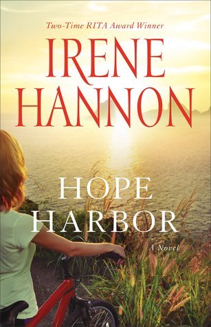
First: the book Tracey mentioned liking the original cover better than the ‘new and improved.’
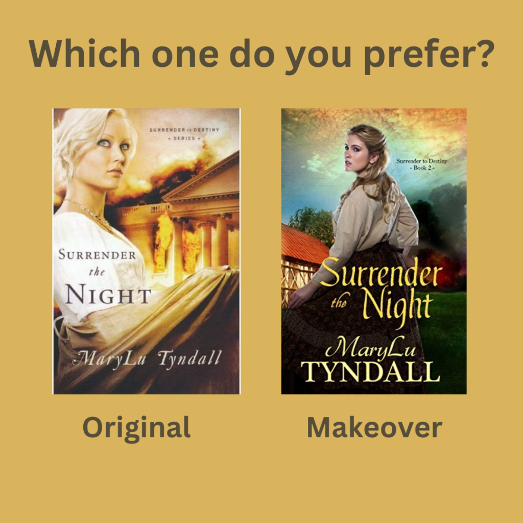
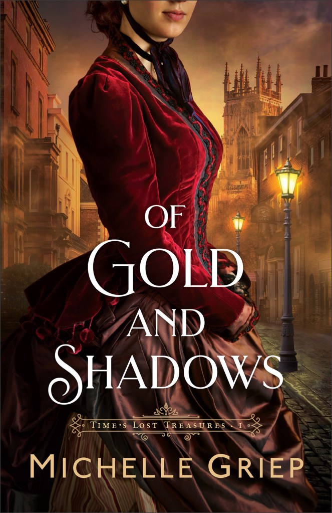
I like the Original cover too. As far as makeovers go, this one isn’t bad at all, but there’s something more dramatic about the original. I think the heroine’s personality shines through much better. She’s daring me to read her story.
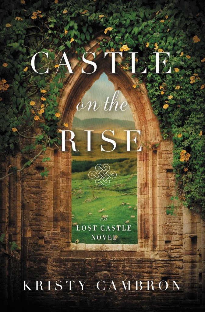
Two series immediately came to mind when Tracey and I had a mini discussion in the comment section of that previous Sunday post. And I much, much, much, prefer the originals in both cases. So much so that I am ecstatic to have the originals in my collection. There just isn’t any contest, as far as I’m concerned. Here they are:

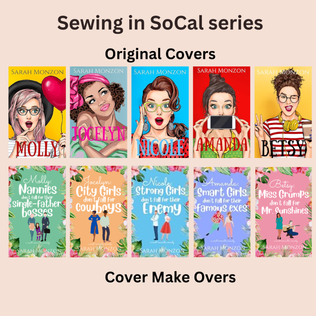
I’m going to be brutal here. I LOVE the original covers for both these series. They are vibrant and alive and so unique. Real standouts. The makeover covers are, well, blah. Like every other romantic comedy cover out there. And I don’t like how there’s less emphasis on the heroines. You can really get a feel for their personalities in the originals but you can barely see them in the new covers.
Why do authors / publishers reissue books with new covers?
The only reason I can think of is if an author gets the rights back to a traditionally published work and maybe there’s something in the contract that says they can’t market the original cover? But I’m just guessing. And that doesn’t explain why an indie author would switch covers. That must be a costly undertaking. Anyone have insider knowledge or other insights? Inquiring minds want to know. 🙂 There must be a marketing angle in here somewhere.
What do you like/dislike in a book cover?
- I like original. I love colour. Texture. Details. Something that creates an ambience to match the story.
- I definitely want to be able to read the author’s name on the cover.
- Bonus if it’s a series and that’s indicated along with the series number.
- I’d prefer a simple, nondescript cover to a poorly designed one. I totally understand that indie authors don’t have the finances to fund graphic artists or create cover photo shoots the way publishers can. BUT, simple is way better than an amateurish attempt to create cover art. (is my cover snob showing?!)
- I’m in the middle of the road about faceless covers. Don’t mind as much when the figures on in the distance, it’s a little more jarring when the whole cover is a faceless hero or heroine. 🙂 But it helps when there are other elements on the cover that hint at the story. I’m thinking of the Sweater Weather series with it’s bright colours and fall themes. Clearly, now that I think about it, I’m attracted to colour.
- I love the fashion on historical covers!
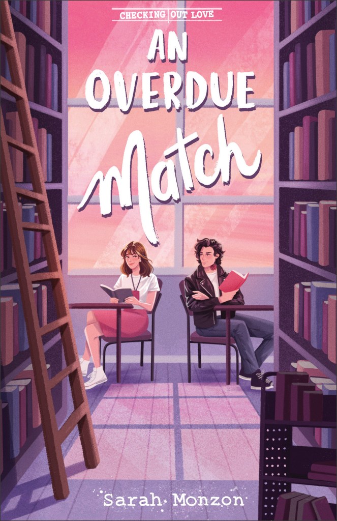
- And one thing I’m totally not a fan of is Disneyish cartoon covers. Like this one:

I feel like this should be the cover of a graphic novel for preteens. 🙂 Just not a fan. I’m wondering if it’s becoming a trend in order to attract new adult readers? By the way, this book is releasing in September and it’s set around a Regency themed singles retreat which sounds fantastic! Hopefully it will be available in audible so I won’t have to look at the cover. Bwahahaha!
Okay, now it’s your turn. Share your cover loves/hates and opinions in a comment below and I’ll put your name in a draw to win a $10 Baker Book House ecard.

Draw will be held and winner announced on Saturday March 22, 2025.